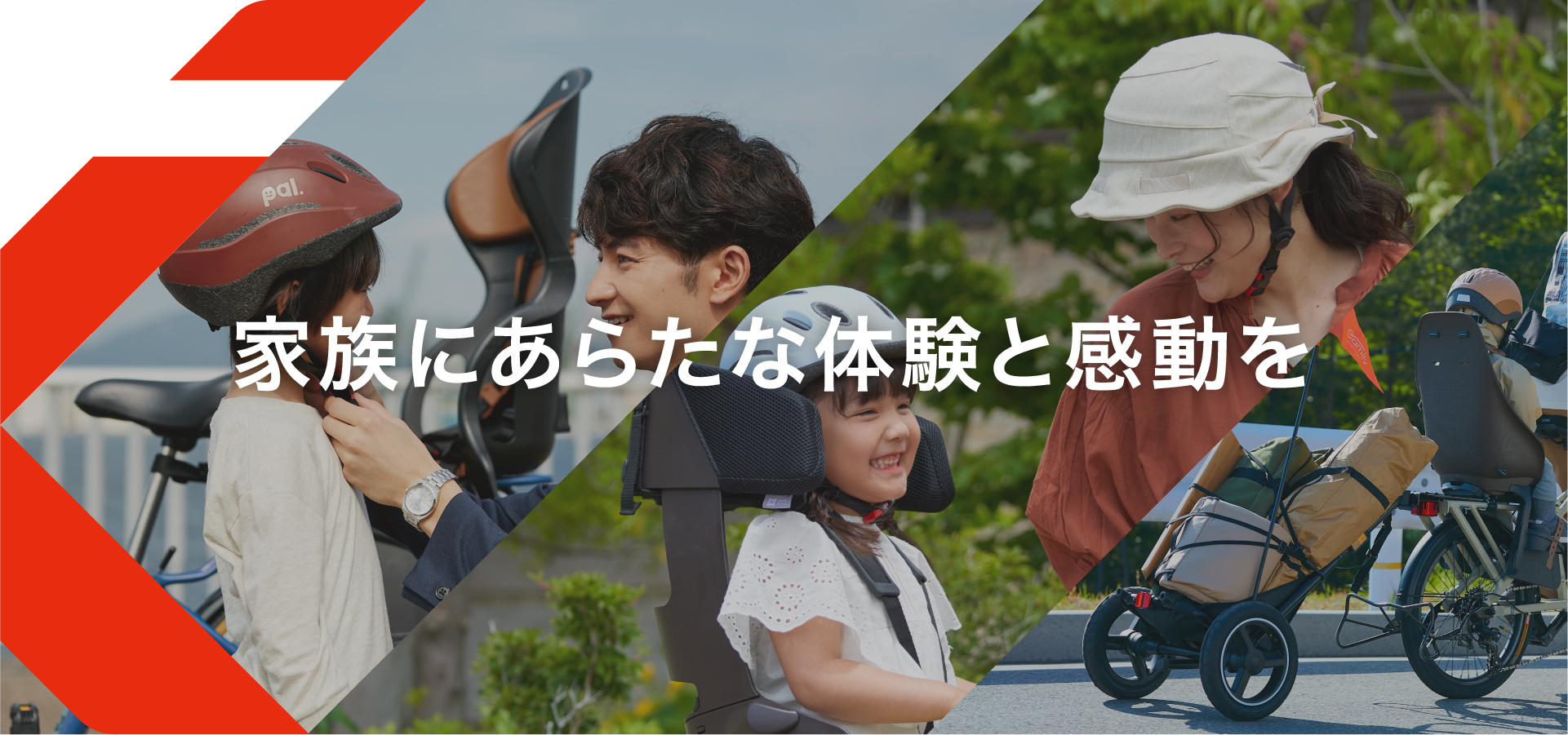
CORPORATE SLOGAN
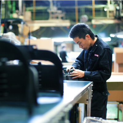
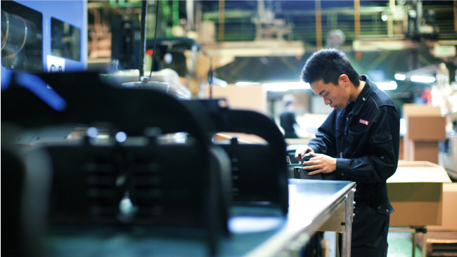
Safety is an essential component when providing reliable quality. At OGK, we provide luxurious products and services that support families on their days out. Whether it’s through the town, in the park, or a trip to the sea, OGK’s child seats provide top-class, reliable Japanese quality to change those regular days into days full of joy.
BRAND LOGOTYPE
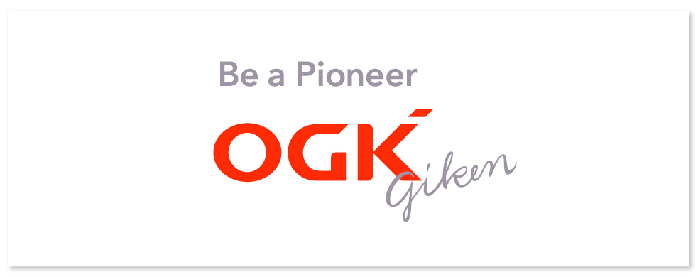
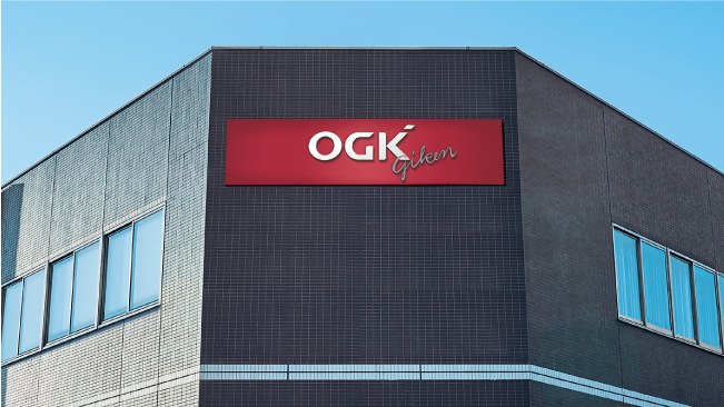
Inherits the color red from passion, the identity of OGK. Taking on “monozukuri” The point in the upper right of the letter K is our flag of ever evolving “pioneers”. Changing the viewpoint of “monozukuri” The “only 1” between G and K. It symbolizes traditional culture at OGK. Refusing to compromise on “monozukuri” The letters “giken” are the love that wraps OGK’s amazing gifts to the world. We continue carrying on the “giken” spirit.
-
-
Pioneer’s signature
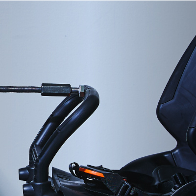
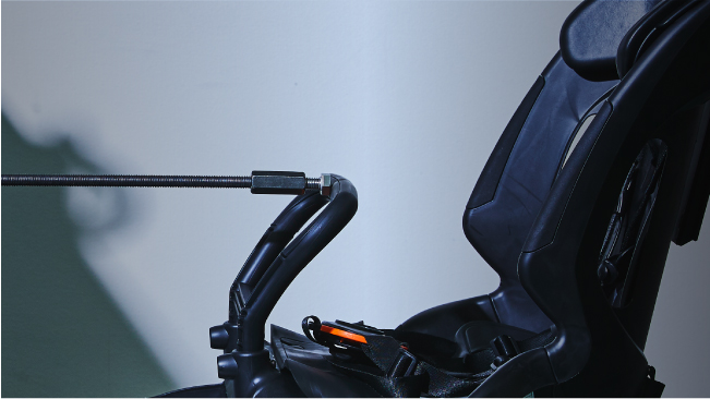
Key visual representing OGK’s desire to create today’s new cycling experience by looking one step ahead.

